
 Inside the Briefcase
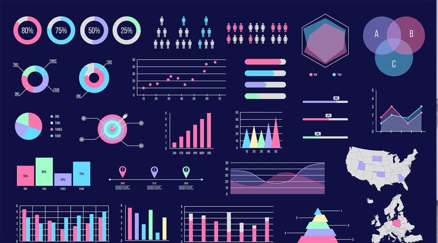


Through The Looking Glass: Data Visualization and Decision-Making
March 23, 2016 No CommentsFeatured article by Martyn Barnett, Managing Director at RMG Networks
Big data is a big deal. Enterprises and small businesses alike are looking for ways to manage this unending flood of information, mine it for actionable insights, and make it a key driver of ROI. Yet with so much data generated moment to moment, it’s easy for IT pros and C-suite executives to get bogged down in the details instead of seeing the big picture. The result? Increased emphasis on data visualization — charts, diagrams and infographics that distil complex concepts down into easily understood, bite-sized pieces. The problem? Not all data visualizations are created equal — here’s how they can all go wrong and how your company can find the right fit.
Best of the Best
What’s the best outcome for data visualization? Ideally, you’re looking for simplicity, specificity and clarity. Observers should have no problem understanding what you’re trying to report, how you’re reporting it, and should easily grasp the intended message. Consider a recent example cited by Forbes: an interactive history of the most popular hip-hop music over the last 26 years.
The idea checks all the boxes. For one, it’s simple, with the top-ranked song for any given month and year at the top of the screen and a side-scrolling bar at the bottom that lets you slide through months or years with ease. Songs play and crossfade into one another as chart position changes; track names and artists are easily visible but kept cleanly off to the side. It’s also specific: only the top-five songs are represented over the quarter-century span. Plus, it provides clarity — you can quickly find exactly the information you need within the confines of the visualization.
Taking that a step further for today’s businesses, data visualization also needs to be intelligent. Having access to loads of data is not as important as the impact of the data — making the data actionable. For example, displaying real-time metrics on performance against goals can be used to directly influence employee behavior.
Bad Data?
Of course, not all data visualizations offer the ideal mix. Best case? Employees and executives still get some value from the image, even if they’re unsure about some data points or if the overall presentation is too complex. Worst case? Decision-makers take action — or don’t — based on flawed or incomplete data, in turn leading to revenue loss. According to Research Live, in fact, 80 percent of executives say that flawed information led to bad decisions while 42 percent said they didn’t act quickly enough and lost revenue.
The bottom line for data visualizations? While they’re dead in the water without a solid foundation, poor presentation can be just as damaging to business outcomes. And if a lack of impact becomes par for the course, CEOs and CIOs start looking for ways to scale back on data investments — ultimately, great data gets lost to slashed budgets.
Stepping Back
How do companies make sure their data visualizations live up to expectations and deliver the right mix of specific data and simple takeaways? Computer World recommends a look into the past. Consider the work of Joseph Priestly and William Playfair — the first to use an X-axis, create line and bar charts, and ultimately visualize the concept of time on a single page. In short, they were innovators, looking for ways to leverage existing data to glean new insights.
Today, however, many companies have adopted an effectively stagnant position by using best practices to rehash rather than reinvent their data. Ultimately, the goal of data visualization, and consequently real-time performance management, is to drive new insight, to empower an “aha” moment, and change the course of business for the better. Doing so means not only using the best and most current information available to create an easily understood image, but incorporating new sources and novel ideas to push data boundaries rather than reinforcing arbitrary limitations.
Martyn Barnett knows first-hand the impact of data visualization as a Managing Director at RMG Networks. Martyn oversees the strategic direction and expansion of RMG’s European and Asia operations for intelligent visual communications.